The Camera Store Blog


Canon Cashback Event
Upgrade your gear and SAVE BIG during Canon’s Cashback Event! With cash rebates of up to $150 on select products, this limited-time offer is too good to miss.

Fun In The Sun: Vlogging Throughout The Summer
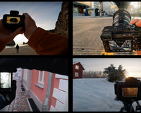
With summer comes days in the sun, hikes, swimming, travels and many more fun adventures. With so much going on, it is the perfect time to start vlogging or up your vlogging game! Long days and epic activities will lead to beautiful and interesting vlogs. You know you’ve thought about it, so what are you waiting for?! To help you get started, we’ve gathered some of the best vloggers out there. Take a look at their content to get creative ideas and learn technical skills like what Sony camera and lenses will work best for you. Get more gear inspiration from our Best Primes Lenses For Vlogging and Best Zoom Lenses For Vlogging in 2023 lists. And for even more video and vlogging inspiration, subscribe to the Sony Alpha Universe YouTube Channel.

How to Stand Out in a Sea of Amazing Creators
I think that's often when the most rewarding art or projects come to fruition, when you step out of your comfort zone, work closely with wonderful people, and trust in the tools of your trade.

Tamron April Sale
Is it time for a little lens refresh? Look no further than Tamron's April Sale! Offering savings of up to $200 on select lenses now is the perfect time to invest in high-quality glass for your camera. Whether you're a beginner looking to step up your game or a seasoned pro in need of a new addition to your kit, Tamron has something for everyone.

Nikon April Sale
If you're a photography enthusiast or a professional looking to upgrade your gear, now is the perfect time to take advantage of the Nikon April Sale! With incredible discounts on a wide range of products, including Nikon Z series mirrorless cameras, DSLRs, lenses, binoculars, and other accessories, there's something for everyone. Don't miss your chance to snatch up savings on your dream Nikon gear and shop the Nikon April Sale now!

Why Delkin Black Memory Cards are the Secret Sauce For Photographers
One often overlooked but crucial component of a photographer's toolkit is the memory card. Delkin Devices Memory Cards are the secret sauce for pho...

How To Create & Share POV Videos On YouTube
We love a good “Point of View” (POV) video that allows you to step into the shoes of other creators to see how they run their own photography shoot. It’s cool to see how different creators set up their cameras and compositions, and they also tend to offer helpful advice along the way. Below we’ve featured a few YouTube creators who are making and posting POV videos on their channels - check them out and hit subscribe. Don’t forget to check out the Sony Alpha Universe YouTube Channel for more tips and gear content from Sony creators.

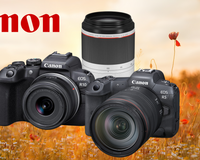
Canon April Savings
Spring is in the air, and that means it's time for Canon's April Savings Event! Whether you're a new photography enthusiast, a professional photographer needing extra equipment, or just looking to upgrade your gear, Canon has something for everyone during this exciting sale. From cutting-edge cameras to high-quality lenses and efficient printers, Canon's top products are sure to make a difference in your creative projects. Let's dive into some of The Camera Store's favourite Canon products that you won't want to miss out on this April.

Large Format Tree Portrait, Before They Cut it Down
The demise of Kodak has been especially hard on film photographers the past few years. It’s hard to believe a photographic company as grand as Kodak can be in the position they are today. (Nobody really knows what’s happening at Kodak).
In Canada, it’s hard to get any Kodak film stocks, black and white or colour, and harder to find any Kodak black and white chemistry to keep us darkroom ghosts developing our film and making silver prints.

How to Choose the Right Strobe or Flash for Portrait Photography
When it comes to portrait photography, having the right lighting equipment can make all the difference in the world. But choosing the right option can be a bit intimidating. Luckily, The Camera Store is here to help! Did you know Godox is one of our go-to lighting brands for capturing stunning portraits? With their innovative lighting systems, Godox has become a game-changer in the world of photography. Explore how to choose the right strobe or flash for your style of portrait photography and how to get the most out of your Godox equipment.

Tamron 28-75mm F2.8 G2 Now Available in Nikon Z Mount
Nikon shooters, listen up! Tamron has announced that the fantastic Tamron 28-75mm F2.8 G2 is now available in Nikon Z Mount! Compact and easy to use with outstanding resolution and superb overall performance, this standard zoom lens is perfect for everyday shoots and well worth the wait!

Capture Near & Far With Nikon's Newest All-In-One Superzoom
Versatility, speed, accuracy, what more could you want? Get it all and more in the new, supremely versatile high-power superzoom Nikkor Z 28-400mm f/4-8 VR! Offering the highest zoom ratio in its class, plus undeniable adaptability, this new lens will quickly become a must-have for travel, sports, backyard wildlife and more!